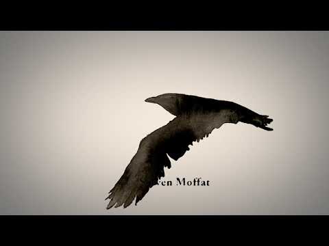
Sherlock Holmes Title Sequence | Re-Imagined
I invite you to explore my experience in reimagining the title sequence for the BBC version of Sherlock Holmes. Using After Effects, copious amounts of India ink, a fish tank, and a sprinkling of stop-motion animation, I created something that I believe embodies the essence of the show.
The choice of crow and ink imagery was a deliberate nod to the rich history and origins of the Sherlock Holmes story. Penned by the esteemed Sir Arthur Conan Doyle in the 1800s, this beloved tale spans four novels and 56 short stories. Drawing inspiration from the works of Edgar Allan Poe, Doyle embarked on the creation of the timeless adventures of Holmes and Watson. Thus, the crow symbolizes not only the influence of Poe but also embodies the sharp intellect that defines Sherlock Holmes himself.
Furthermore, the incorporation of ink in the sequence serves a dual purpose. Not only does it pay homage to the ink-stained pages of traditional storytelling, but it also infuses an enigmatic and fluid essence into the visual imagery on the screen. This careful utilization of ink evokes the sense that static forms on a page have remarkably come to life, mirroring the captivating essence of the story itself.
Services: Motion Graphics, Animation, and Illustration
